
Tenebrous Colour Scheme
On this page
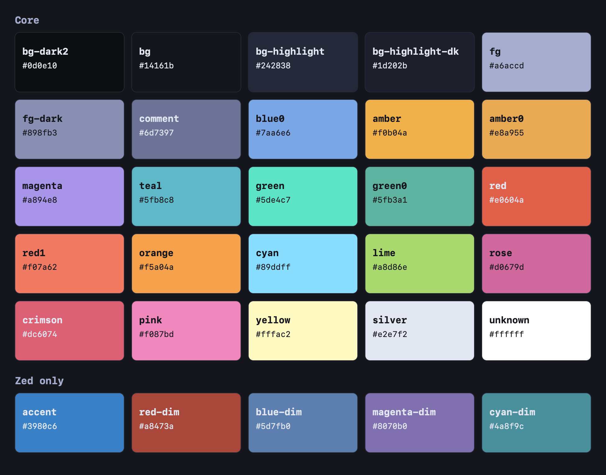
Tenebrous started out inspired by Poimandres and has grown into something more unique.1 It is a dark colour scheme. The background is a near-black blue and the text is a soft grey-purple. Amber is the main accent, used for links and headings, and blues, purples and greens cover the rest, with red and pink used sparingly. (But it is very pretty!)2
Themes
I have two themes built from it so far, one for Obsidian, which is what I live in, and one for Zed.34
Contrast
I measured every text colour against the background (#0d0f14) with the WCAG formula, where AA needs 4.5 to 1 for normal text and AAA needs 7 to 1.56 Every text colour passes AA, including faint text at 6.30 to 1, and faint text stays above 4.5 to 1 even on the lightest surface (borders, hover and selected rows). I raised the contrast after the first version, when faint text only passed for large text.2
I did not require AAA. That much contrast is not something I need yet, and designing for it leads to many sites looking the same.6
One place for every colour
Every colour lives in palette.json, and a build script writes the Obsidian palette, the Zed theme and the palette image from it, so a colour only ever gets changed in one place.
Anthropic’s Claude did help me write the build scripts.2
Footnotes
-
GitHub, Poimandres theme ↩
-
GitHub, Tenebrous README ↩ ↩2 ↩3
-
GitHub, Tenebrous-Obsidian ↩
-
GitHub, Tenebrous-Zed ↩
-
W3C, Understanding Success Criterion 1.4.3, Contrast (Minimum) ↩
-
W3C, Understanding Success Criterion 1.4.6, Contrast (Enhanced) ↩ ↩2